AccessibilityColour and contrast
Many users rely on colour and contrast being clearly visible to consume content or move through our services.
It is important contrast is clear, though there also should be alternatives for those who cannot see clearly.
Foreground: #ffffff
Foreground: #0b0c0c
See the colour page for the full list of accessible text and background combinations.
See the impact that colours with good contrast have on user interaction, or read about Lee, an online shopper with color blindness.
Helping everyone
When designing websites, it is important that you use sensible colours that make text, focus indication and other parts of your website easy to see.
The colours you choose for your websites can affect a number of users and make content hard for them to consume or move through.
If websites do not have clear contrast, it can make them completely unusable for some users with visual impairments or colour blindness. It can also introduce eye strain or other issues in other users.
While tools exist for users to change the contrast on their own, sometimes these don’t work. This could be because we have forcibly set the colour, or there may be other compatibility issues. Because of this it is always best to use approved colours as standard.
The basics
Do:
- check your website colour scheme for contrast standards (standard text 4.5:1, everything else 3:1)
- make sure your website works in Windows high-contrast mode
- check that you can clearly see where focus indication is on a screen at a glance
- ensure that users can change colours with Operating System (OS) or browser settings
- use standard GOV.UK components
Do not:
- use only colour to demonstrate information
- use only faded or other colours for greyed out (non-active) content without other identifiers
- use text colours that are hard to see against a background
| User | Access need | May find helpful |
|---|---|---|
| Blind | Alternative instructions to visual content | Not using colour only to provide information Text-based instructions |
| Colour-blind or partially sighted | Colour selections can make text difficult to see or cause eye strain or migraines | High-contrast mode Adjustable colour settings Clearly visible elements including text and focus indication |
Creating good content with colours and contrast
Measuring contrast
We measure how visually distinct a colour is by looking at the contrast ratio with surrounding elements.
For example, text would have the contrast ratio measured against the background colour.
Text contrast
The contrast requirement for text is 4.5:1 against the surrounding background colour.
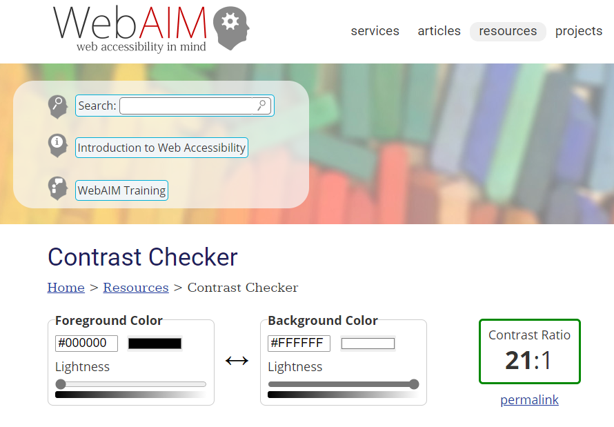
For most GOV.UK services we use black text against a white background. This combination has a contrast ratio of 21:1, easily meeting the requirements.
Alternatively, bad contrast may be something like the following.
Bad example text in yellow. Have you ever seen slides in a presentation where the speaker has yellow text on a white background? It makes it almost impossible to see for many users.
For large text (above 18pt font size), or non-text elements such as focus indication or icons, the contrast requirement is 3:1.
How users can change their contrast settings
There are tools which allow users to change the colour settings on their computer to make things easier to read.
One such set of tools that can help you test what users are seeing are the ‘colour filters’ and ‘high contrast’ options within the Windows Ease of Access Centre. These controls are often used by those with colour blindness, visual impairments or eye strain issues to make content easier to see.
Colour filters
Colour filters are a great range of options that allow users to tailor the colours they see on their screen. This can address issues related to colour blindness, such as turning everything greyscale, or address specific issues such as red-green colour blindness.
High contrast
High-contrast modes are a more significant visual change which often invert text and background colour – for instance, changing black text on a white background to white text on a black background with different distinct colours for links and other elements.
This not only makes text more readable for many but the switch to a ‘dark theme’ also reduces brightness, which can reduce stress on the eye.
Checking your colour contrast
The WebAIM contrast checker is a web page where you can input two colours that you are planning to use and it will tell you the contrast ratio.

Most automated testing tools such as Microsoft Accessibility Insights check for contrast issues. These can be useful for quick checks on a page, but do not only rely on automated tools – you should manually check contrast ratios as well.
Get in touch
If you’ve got a question or suggestion share it on the Home Office DDaT Slack channel #ask-accessibility or email access@digital.homeoffice.gov.uk.