AccessibilityLinks
Links normally look like underlined text, or an icon/button which takes you to another page when you click it.
Presenting links in the right way is important for accessibility and inclusion.
See the impact that accessible links have on people who use text to speech software, or read about Ilya, senior staff member who is blind.
Helping everyone
All users will benefit if your link text is clear and you can easily identify a link among its surrounding text. It’s also important to everyone to know where a link will take them before they click it.
The basics
Do:
- use clear and concise link text that describe the destination
(for example Learn how to get financial help if you’re disabled) - ensure links look different from surrounding text with at least two of the following:
colour, size, bold, underlined - make sure the links work, with keyboard as well as mouse, using the tab and enter keys
- make sure links take you to where you’d expect
Do not:
- have links that show the full URL
- have links that are not clear on destination such as ‘click here’ or ‘read more’
- set links to open in new tab or new window, unless this is necessary for the service (such as separate guidance content that the user may want to check against as they go through the service) and you tell users that a new tab will open
| User | Access need | May find helpful |
|---|---|---|
| Blind or partially sighted | A screen reader may read links separately from their surrounding text | Unique link text that describes the destination |
| Blind | Opening a new tab without warning can be confusing | Warn users if a link will open in a new tab |
| Colour blind or partially sighted | Cannot see links that are only a different colour from the surrounding text | Underlining links |
| Motor impaired | Cannot use a mouse | Links that can be seen and activated using a keyboard |
| Motor impairment or dyslexia | Uses voice controls instead of mouse or keyboard | Links that are clearly visible |
Creating good links
Make them descriptive
Link text needs to clearly show which page it will open when clicked.
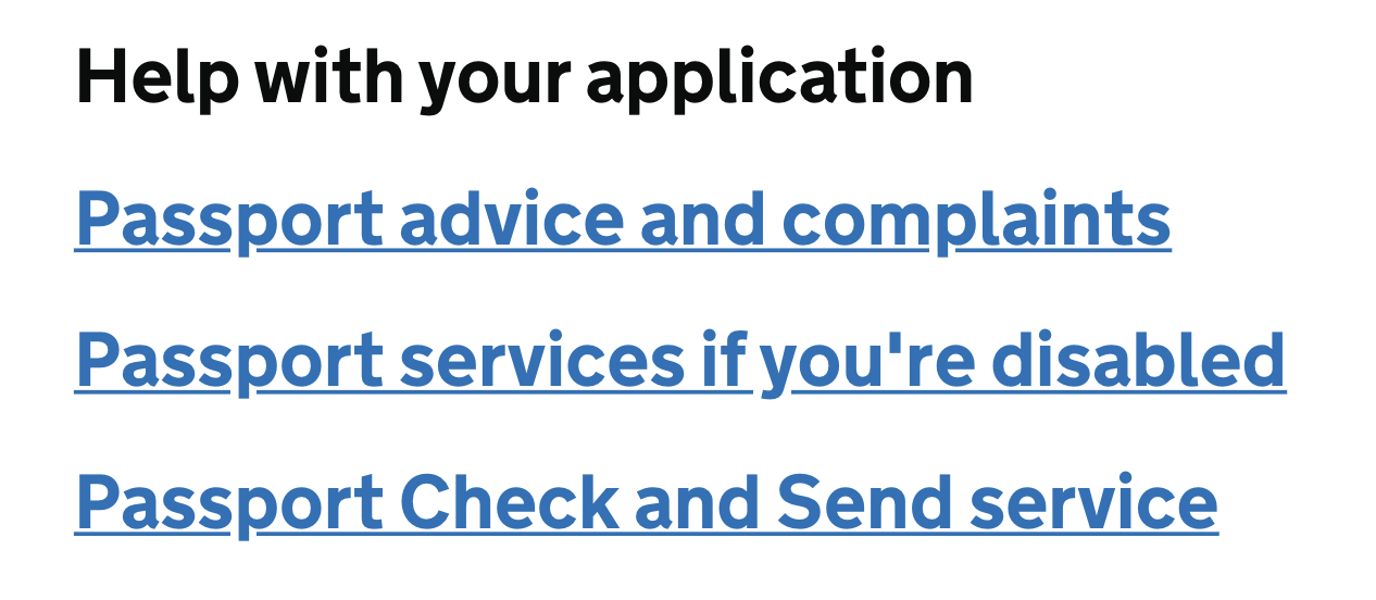
It should always make sense by itself and should not rely on surrounding content to be clear on where it goes to. This means that link text should say things like ‘contact us page’ or ‘article on Home Office accessibility’. Each of the three links in the example below clearly explains the action they lead off to.

Link text should not be a URL directly on the page. The only exception to this is when adding links to emails, because it’s important that email users know and trust the destination before clicking.
Links should not say things like ‘click here’ or ‘read more’.

Links can also sometimes look like buttons, icons, or pictures that users can click. An example of this is using a logo image at the top of your website as a link to the home page. In these cases, the alt text of the image should describe the link destination, not the image itself.

Make them visible
Links should be easy to spot on a page and be clearly different from the surrounding text.
You should always use at least two differences when deciding how links will look. Most often this will be colour and underlining.
Make sure that links are very clearly a different colour to the surrounding text.
Good example:

Bad example:

Using underlines is also important, because using colour alone may be hard to see for some colour-blind users or those with visual impairments.
Make them unsurprising
Does the link do what the user expects when they click it?
It’s important that, along with clear link text, a link takes the user to where they expect to go and does not do anything unexpected.
Normally a user expects a link to take them to a new page within the current browser window or tab that they’re in.
An example of doing something unexpected is if content opens in a new browser tab or window. If you have to do this you should tell users that this will happen in the link text or with a clearly defined icon.
Get in touch
If you’ve got a question or suggestion share it on the Home Office DDaT Slack channel #ask-accessibility or email access@digital.homeoffice.gov.uk.