AccessibilityLayout and typography
Clear layout and fonts help make web pages and documents more readable. Users with low vision may need to adjust text or screen size, and some users may have a device in a fixed orientation, so it’s important that your design can adapt to these user needs.
Helping everyone
Having a clear and readable layout is important to all users, as it helps people find the important information quickly. For users with low or no vision, a well-planned page structure will reflect the reading order and any in-page navigation.
The basics
Do:
- make sure your design works with a variety of screen sizes and orientations
- use clear, consistent layouts with plenty of headings and line breaks
- use large, readable fonts
- align your content to the left margin to make reading easier
- use HTML landmark tags on content blocks
Do not:
- use italics or ALL CAPS for blocks of text
- leave large areas of empty space on your page
- use absolute units like ‘px’ for font sizes and spacing – use relative units like ‘em’ instead
| User | Access need | May find helpful |
|---|---|---|
| Dyslexic | Finds large blocks of text and unusual letter shapes harder to read | Break up longer paragraphs with line breaks Use clear and readable fonts Don’t use italics or ALL CAPS |
| Low vision | May use strong magnification and only see a small part of the page May adjust font size or letter spacing |
Consistent page layouts Left-aligned content No big empty spaces in between content Spacing and font sizes with relative units so that they can be adjusted to a user’s needs |
| Blind | Uses a screenreader to navigate around the page | Landmarks coded into the html to help with screenreader navigation |
| Mobility impaired | May have their device attached to a wheelchair in a fixed orientation | A layout that responds to a device’s orientation and doesn’t force either a portrait or landscape format on the user |
Accessible typography
Fonts
The Home Office and GOV.UK design systems both use fonts chosen for clarity and readability, so use them if you can. In emails, documents, or third-party products that allow limited customisation, choose a font that is open and clear. Because all users have different needs, there’s no such thing as a fully ‘accessible’ font, but usually it’s better to choose a sans-serif font (such as Arial) over a serif font (such as Times New Roman).
Styling
Don’t use italics, as this text can be difficult for dyslexic users to read. ALL CAPS should be used sparingly for similar reasons, and never used for full paragraphs or blocks of text. Bold text is the best option for emphasis within a paragraph.
Reflow and resizing
Many users will resize their screens, zoom in, or use browser settings to adjust the size and spacing of text. Make sure your service is set up to accommodate this. Relative units such as (em) and % will allow your text to reflow and resize to fit user needs, so use these instead of fixed units such as px.
Make sure your design is flexible enough to still work with larger text (inside buttons or table cells, for example) – users should be able to zoom up to 400% without losing page function.
Your service must work in both landscape (horizontal) and portrait (vertical) orientations, for users who may not have a choice in which orientation they use. For example, a paraplegic user with a device attached to their wheelchair in a fixed orientation.
Creating accessible layouts
Make sure your content is presented in a logical reading order, which stays consistent even if the page is resized and the text reflowed.
Title and headings
The page title, which appears in the browser tab, is vital for user navigation, and should always be unique. We recommend you use a format of ‘page – service – site’ for title text, for example ‘Enter your address – Apply for a passport – GOV.UK’.
Clear headings are important to help users find content within a page – see the headings guidance for more detail. You can also use skip links to help keyboard users bypass repeated blocks of content.
Don’t capitalise every word in a title – it's easier for users to read ‘sentence case’, where only the first letter of the sentence is capitalised
As well as headings, screenreader users can also use extra navigation functions such as landmarks to navigate within a page.
Landmarks
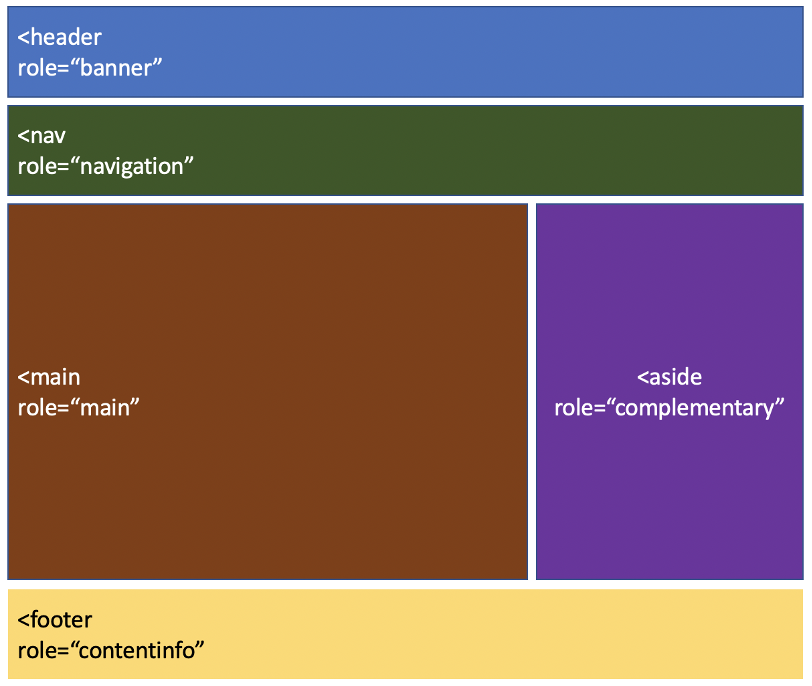
Landmarks are HTML5 elements that break up and label blocks of content by their purpose on the page. They’re often used alongside an aria role to make the structure even clearer, especially for users of older browsers. Screenreader users will often rely on these to jump straight to relevant content, rather than navigating through the entire page.
The most common landmarks are:
- header (for page header content)
- nav (for navigation bars)
- main (for the main content on your page)
- aside (for secondary sidebar content such as related links)
- footer (for links to further info about your site)
An example of how to use landmarks in your page layout:

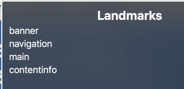
Example of how this appears to a screenreader (from the screenreader Voiceover on Mac)

Get in touch
If you’ve got a question or suggestion share it on the Home Office DDaT Slack channel #ask-accessibility or email access@digital.homeoffice.gov.uk.