AccessibilityNotifications
Sometimes a page needs to dynamically display a status message.
These messages need to be communicated to assistive technology users, even when they don’t receive keyboard focus.
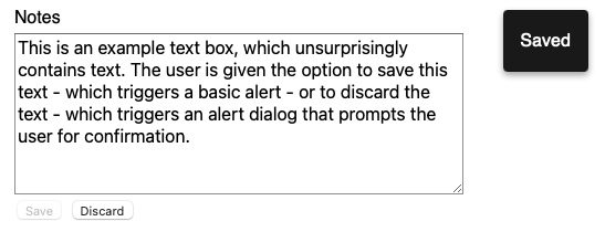
The following in an example of a notification presented to the user upon saving the text taken from the W3C WAI-ARIA Authoring Practices 1.1 Alert Dialog Example.

See the impact that notifications and feedback have on user interaction.
Helping everyone
All users benefit from clear, visible notification messages which are presented in a consistent, predictable way.
Notification messages are especially important for screen reader users who may not be able to perceive the information visually.
The basics
Do:
- use ARIA live regions to communicate status messages or updates to screen reader users
- use the polite setting (see more under ‘Announcements’) to avoid interrupting other screen reader announcements
- keep visual and keyboard focus in the same place on the page
- give people enough time to read the notification message
Do not:
- use visually intrusive notifications
- overuse alerts in a way that causes frequent interruptions
| User | Access need | May find helpful |
|---|---|---|
| Blind and partially sighted | Cannot see the visual elements of a notifications message | ARIA live regions that announce notifications to screen readers |
| Partially sighted | Can be unaware of or not find notifications before they disappear if focused, perhaps using magnification software on other parts of the screen | Easy to locate notifications Consistent placement on the page |
| Cognitive, language and learning disability | May be easily confused by unexpected changes of focus | Visual and keyboard focus remaining unchanged Unobtrusive notifications |
| People with low digital literacy | May not be able to locate the notification message once it’s closed | Consistent placement on the page |
| Lower reading age Non-native English speaker |
May have limited vocabulary or be using translation software | Clear, descriptive language in notifications Enough time to read the notification |
Creating good notifications
Notification messages do not typically ask a user to do something. If user interaction is needed you would most typically do this using a modal dialogue.
Announcement
Notification should give general information and update users. Status messages or updates which occur visually should also be communicated to screen reader users.
Notification and status messages should be implemented using an ARIA live region. Only screen reader users will benefit from ARIA live regions.
Use the polite setting, which prompts the screen reader to announce the change when the user is idle to avoid interrupting them. Avoid using the assertive setting for ARIA live regions unless this is communicating something time-sensitive or critical.
Setting role="status" aria-live="polite" ensures compatibility across browsers.
<div id="notification" role="status" aria-live="polite"></div>
Use a script to insert text into the live region to notify a screen reader.
See Using role=status to Provide Status Message on Search Results and Using role=status to Provide Status Message on Shopping Cart for working examples on how to implement role="status".
Where a notification is visual rather than textual, provide some visually hidden text describing the interface response. If success is communicated via a green tick for example, provide that response as visually hidden text.
Appearance
Notifications should be non-intrusive and only used when there is a benefit to the user, for instance informing them how many search results have been returned, that errors have occurred in their submission, or that a form has been successfully submitted.
Ensure that notifications are visible for long enough to allow people to successfully locate and read the message. See Designing Toast Messages for Accessibility for a calculation of the minimum amount of time that these should be displayed. Ensure that notification messages are located in a consistent location and that these do not overlap critical content.
The message should be clear, concise, and easy to understand. See our readability guidance for information on how to make your language easier to understand.
Ensure that text and icons have sufficient colour contrast and that meaning is not conveyed by colour alone. See our colour and contrast guidance for information on how to ensure that text meets minimum contrast requirements.
Notification text should respond to user adjustments such as:
- resizing up to 400%
- changing style properties, for example line height and letter spacing
Limit the number of notifications to reduce visual distraction, as well as auditory distraction from screen reader announcements and any notification sounds.
Interactivity
Where notifications do not close automatically, present a way to close them using either the ESC key or using a dedicated close button.
Focus
Where possible, avoid moving the visual or keyboard focus.
Get in touch
If you’ve got a question or suggestion share it on the Home Office DDaT Slack channel #ask-accessibility or email access@digital.homeoffice.gov.uk.